Experiments in websites/databases with hundreds of links on the homepage
Concept: present all/majority of a website's information on its home screen. The goal being, allow people to curate and navigate information by their own volition, as opposed to a designed route or system.
Concept: present all/majority of a website's information on its home screen. The goal being, allow people to curate and navigate information by their own volition, as opposed to a designed route or system.
Statement: Designers build systems and "experiences" that allow people to access—or in many cases, not access—information and data.
Question: How can we subvert designer's roles in the accessing of information? Can a designer build autonomy into a system, allowing persons ("user") to access information with as little influence from the designer's biased design and system? Can designers truly build a "user experience" that is unique to the needs of so many individual using the internet?—as is often the UX, designer's frame.
Are designers empathetic or are designers manipulative?


RESIDENT ADVISOR DEMO
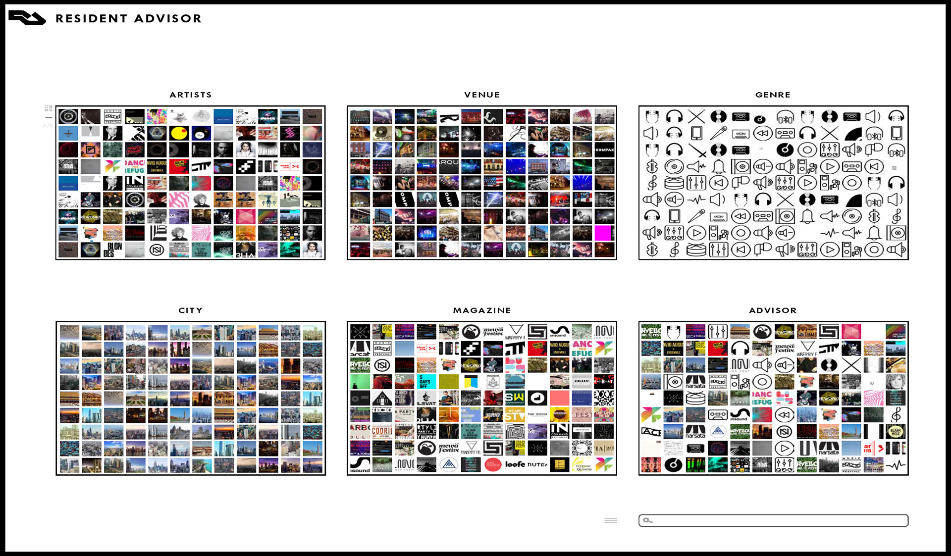
RESIDENT ADVISOR
All imagery in containers is scalable via controls located to the left of the 'ARTIST' container. Each container is responsive to all others. If a user knows the artist by album artwork they can click directly into that artist's information. Users can also hover to read the name or have screen reader assist. Access to individual module can be selected and/or scrolled through on the home page with mouse hover and scroll. People can choose to move through the site based on city, genre, artist, venue, or the magazine, to access the desired information. If information desired is unknown, the 'ADVISOR' container is curating based on selected/clicked information, location, and requested data mined from device.
All containers are color coded for the user to know which container is enacted via the frames of the page and container which match in color. This site takes full advantage of the not used imagery of artists, venues, shows, as well as audio, which plays when a specific point is reached in the site or hovered over.
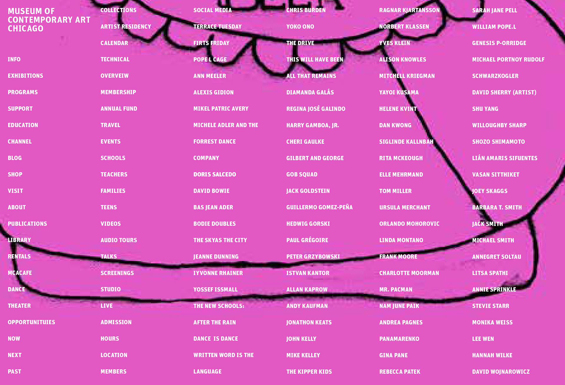
MUSEUM OF CONTEMPORARY ART CHICAGO
Video demo
Video demo
All information is interactive and color coordinated, thus able to be categorized by visual and screen reader technology, which can read selected and responsive information. When users hover over 'EXHIBITIONS' an underline will highlight all current artists exhibitions, screenings, and other materials. When the users clicks an artist, they are taken to a page of selected artist works, then, to an information page of the artist and relating materials to the museum. This information is embedded with audio from the artists, museum tours, curators notes etc. to be played as needed or desired. Further clicks and scrolls delve deeper and/or back to other information. Artwork is also updating and changing on home screens background showing current exhibitions, performances, guest artists, with descriptions via audio, screen reader, implemented by curatorial staff and artist.
Home screen
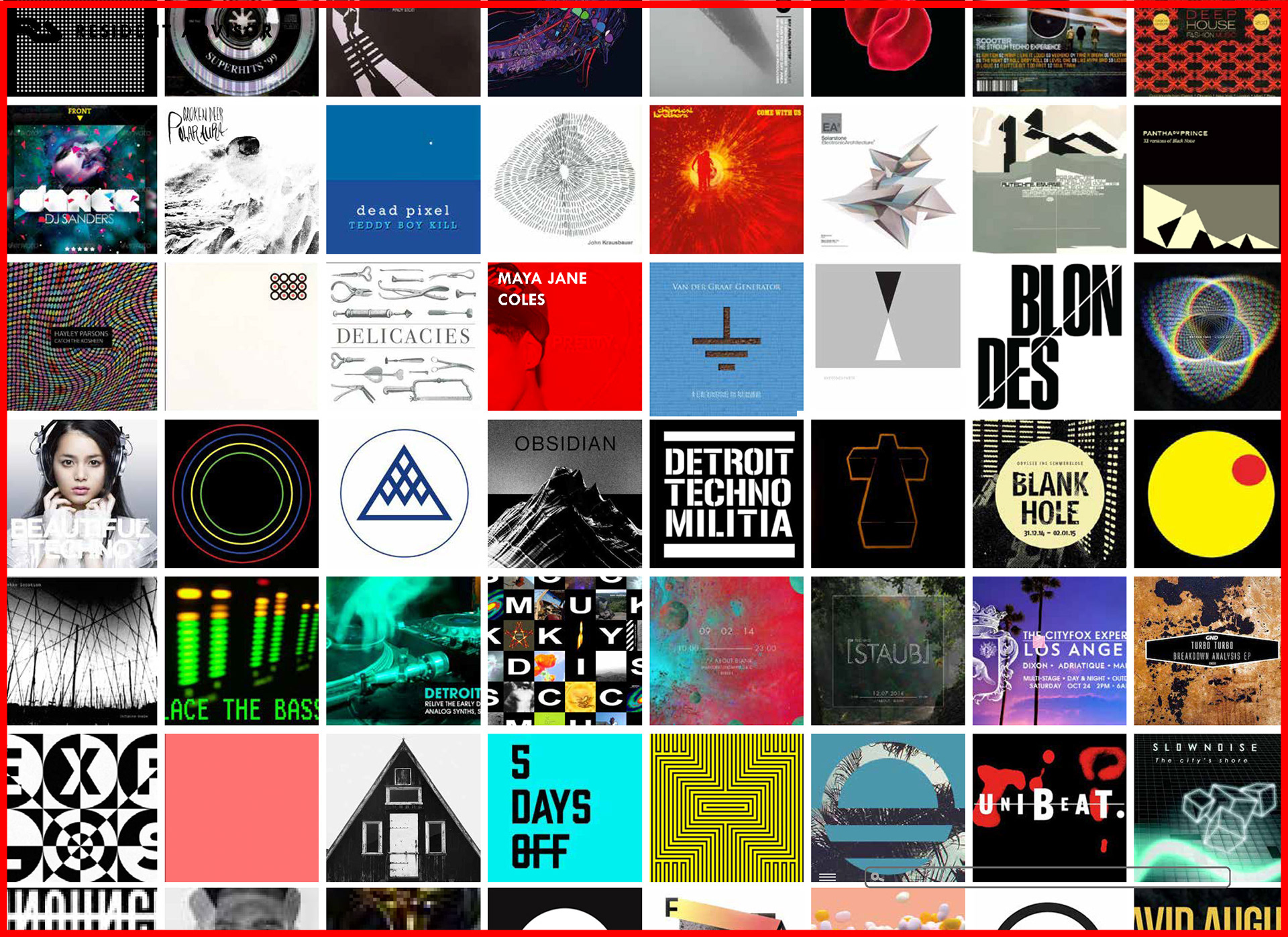
ARTIST container fully enacted (red border of site) with scroll and artist hover (Maya Jane Coles

Artist Selected (Maya Jane Coles)
Artist and city selected (London) ft. hover state
Artist, city and venue selected to bring up show, with the latter available at the top of the page for access back to specified container.
London with magazine hover/click
London Magazine Adam Beyer
Click back to Magazine
To homepage
Homepage: venue and artist hover/click
Back to venue, genre selected, city hover, show advised
Options enacted