BRANDING / PROCESS:
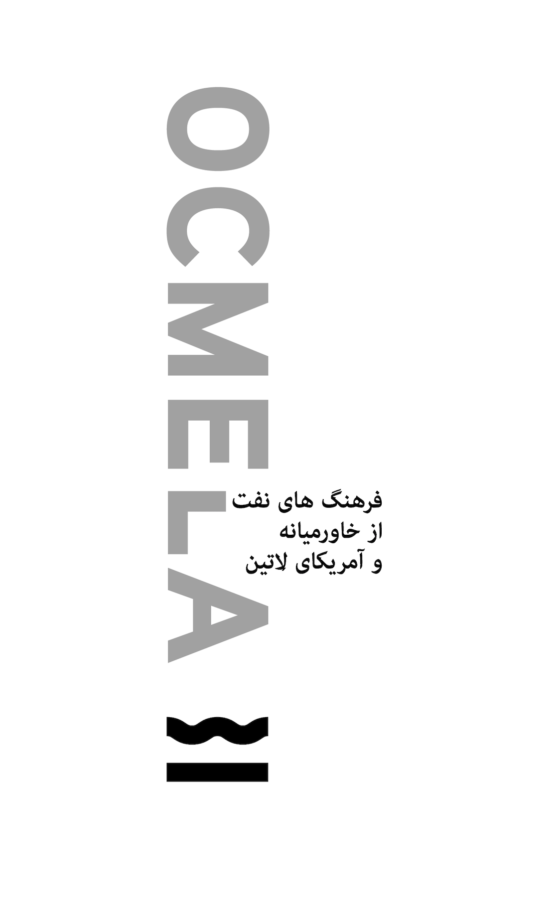
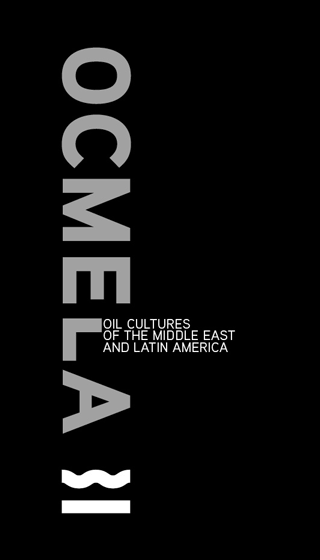
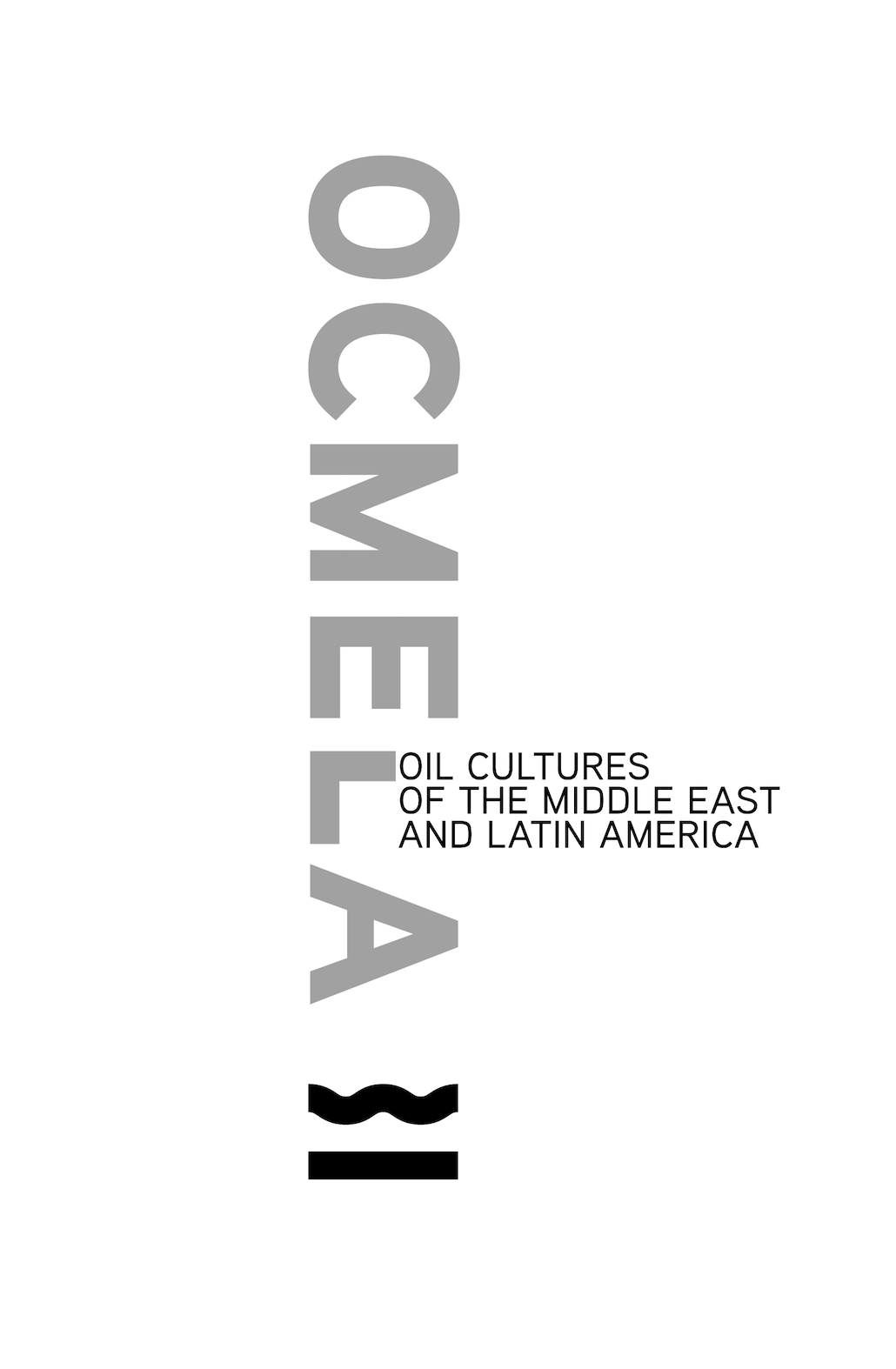
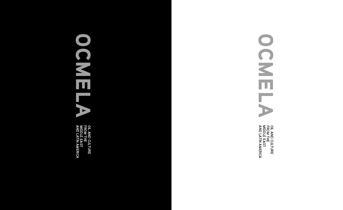
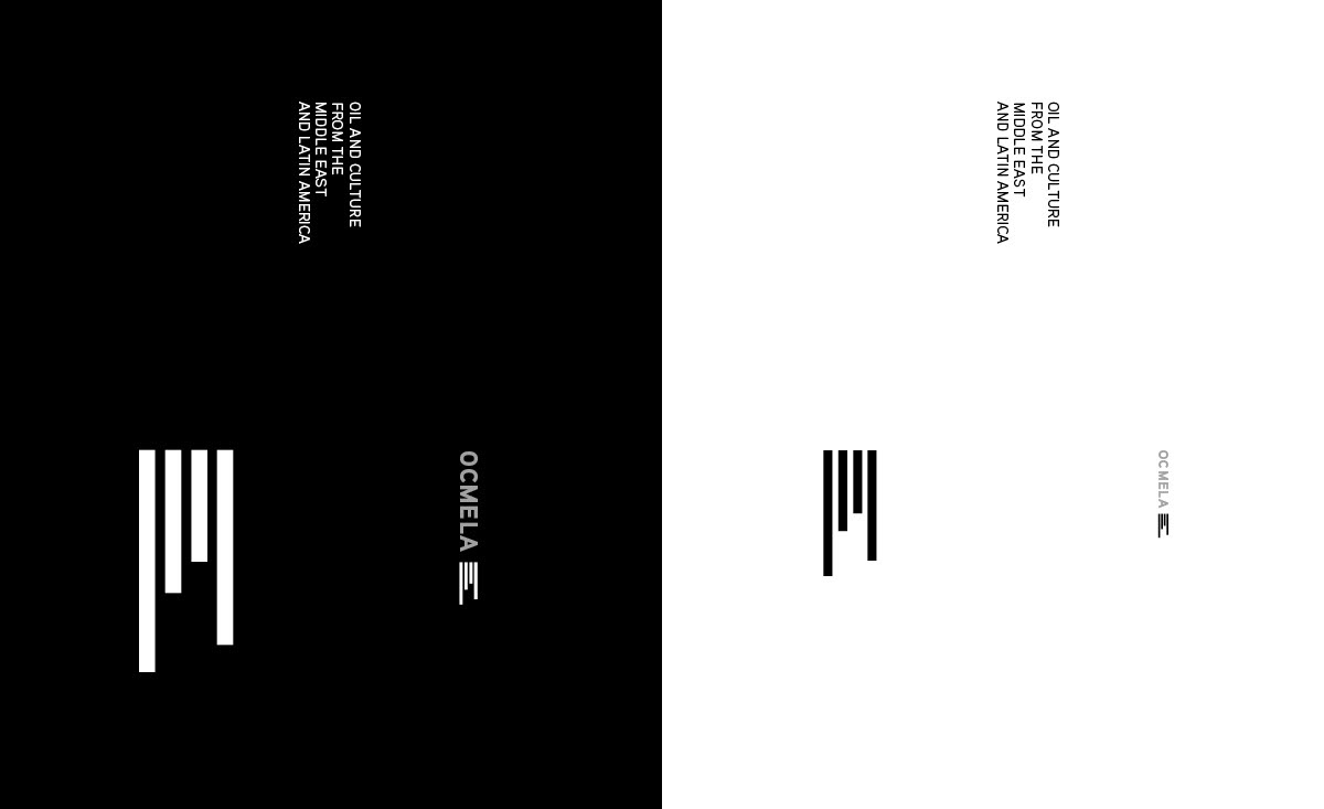
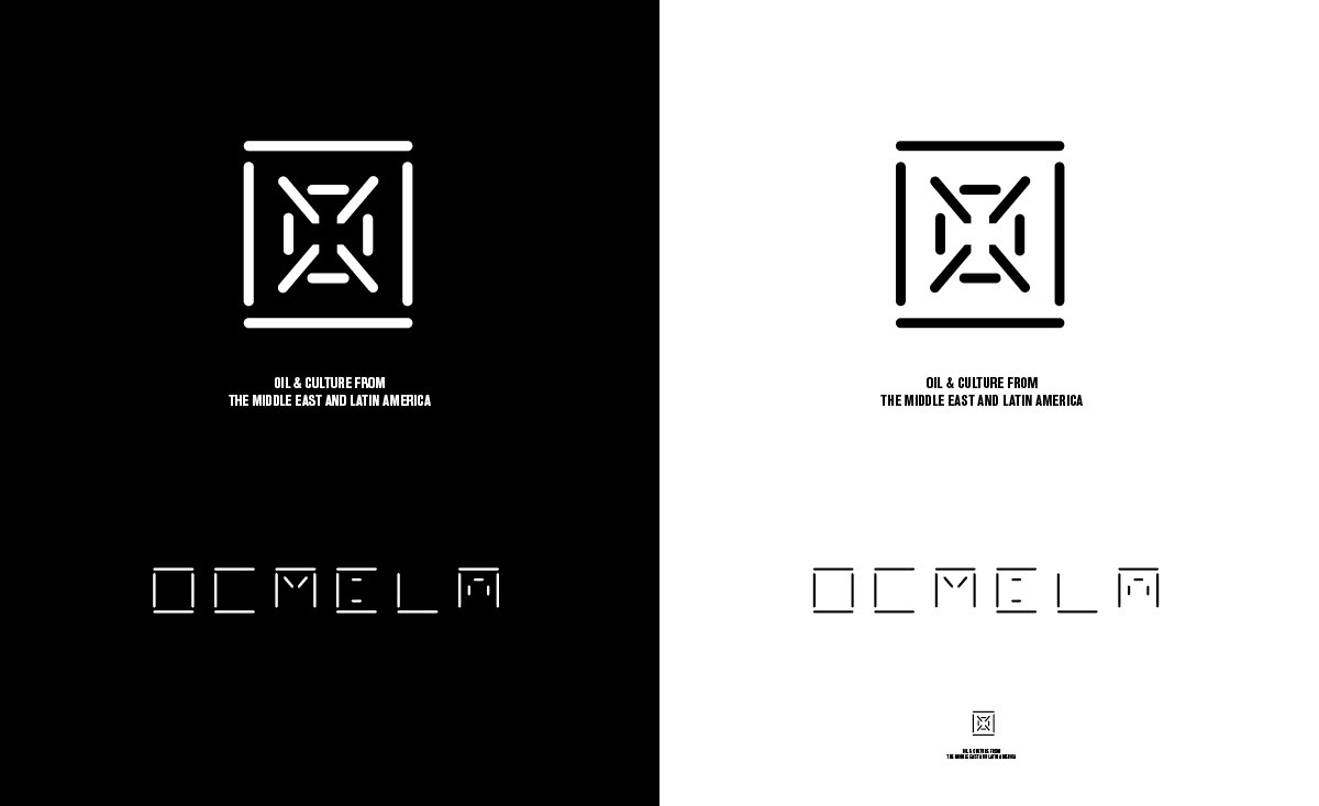
Oil Cultures of the Middle East and Latin America (OCMELA)
Oil Cultures of the Middle East and Latin America (OCMELA)
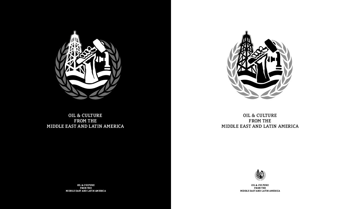
Parts resemble oil derricks from different perspectives while type acts as a representation of oil. Soviet-era styles, and geopolitical references (passport) for a collective of globally based researchers and academics. (I did not work on the website redesign: ocmela.com)
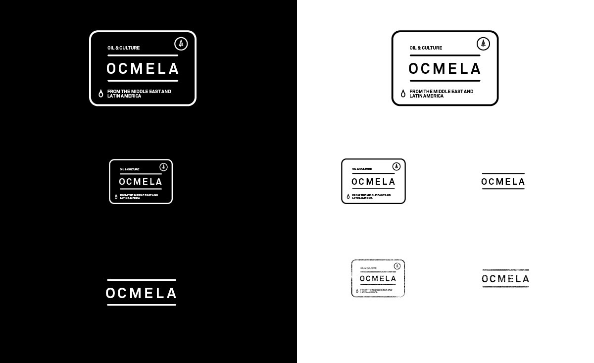
Chosen mark and elements
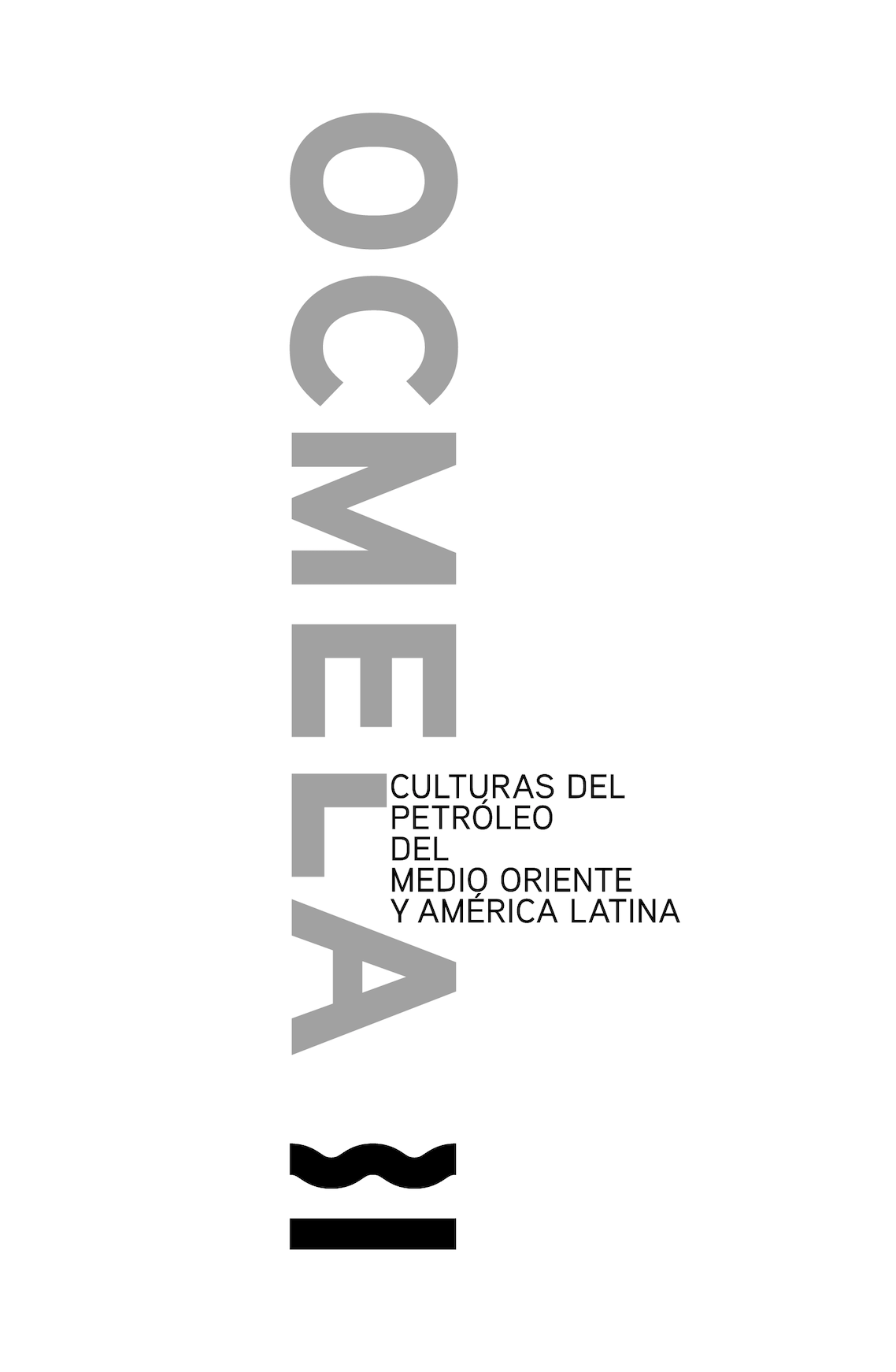
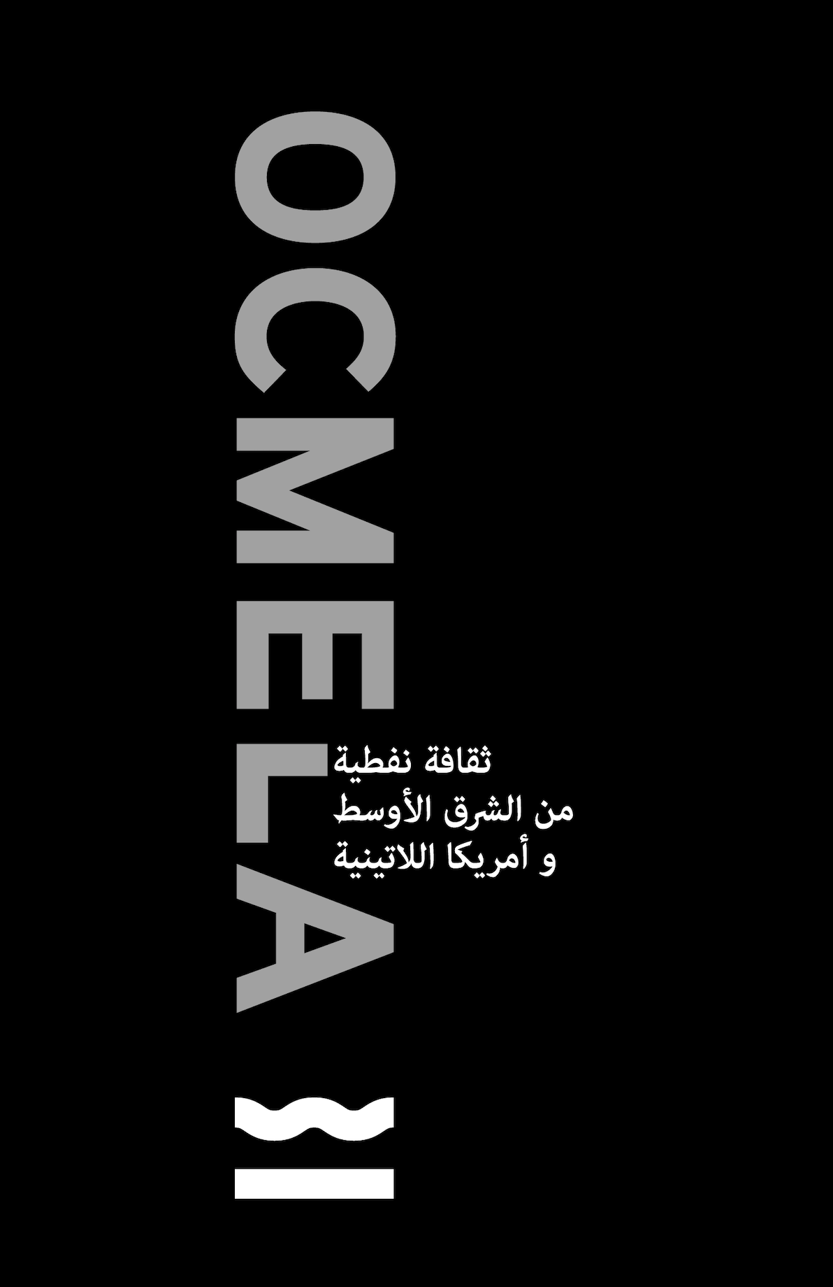
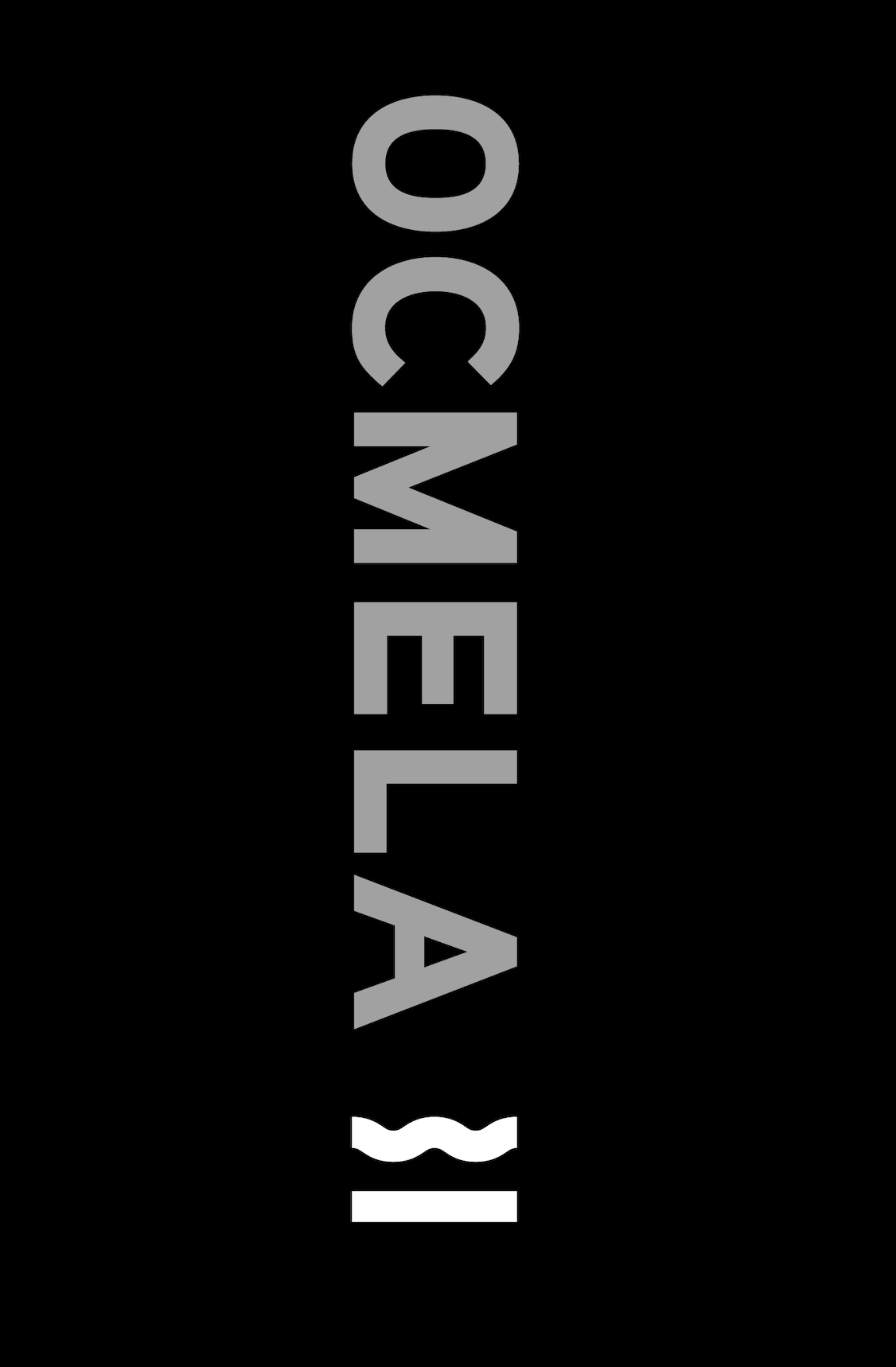
Proposed concepts OCMELA
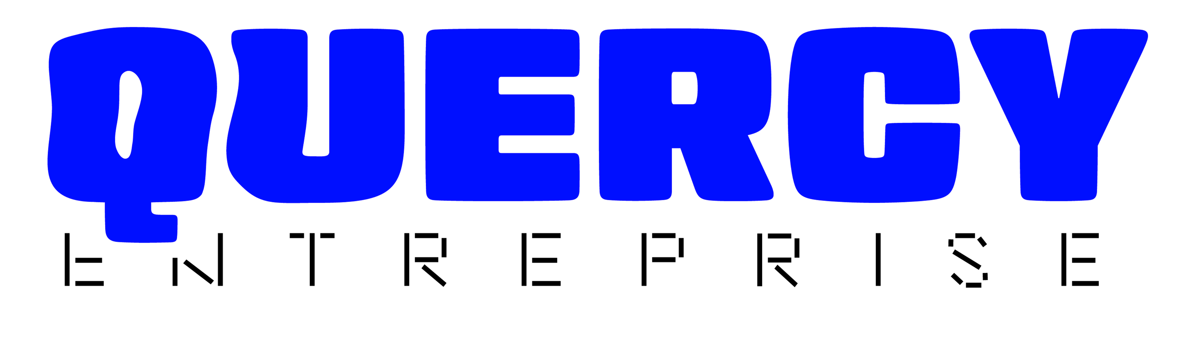
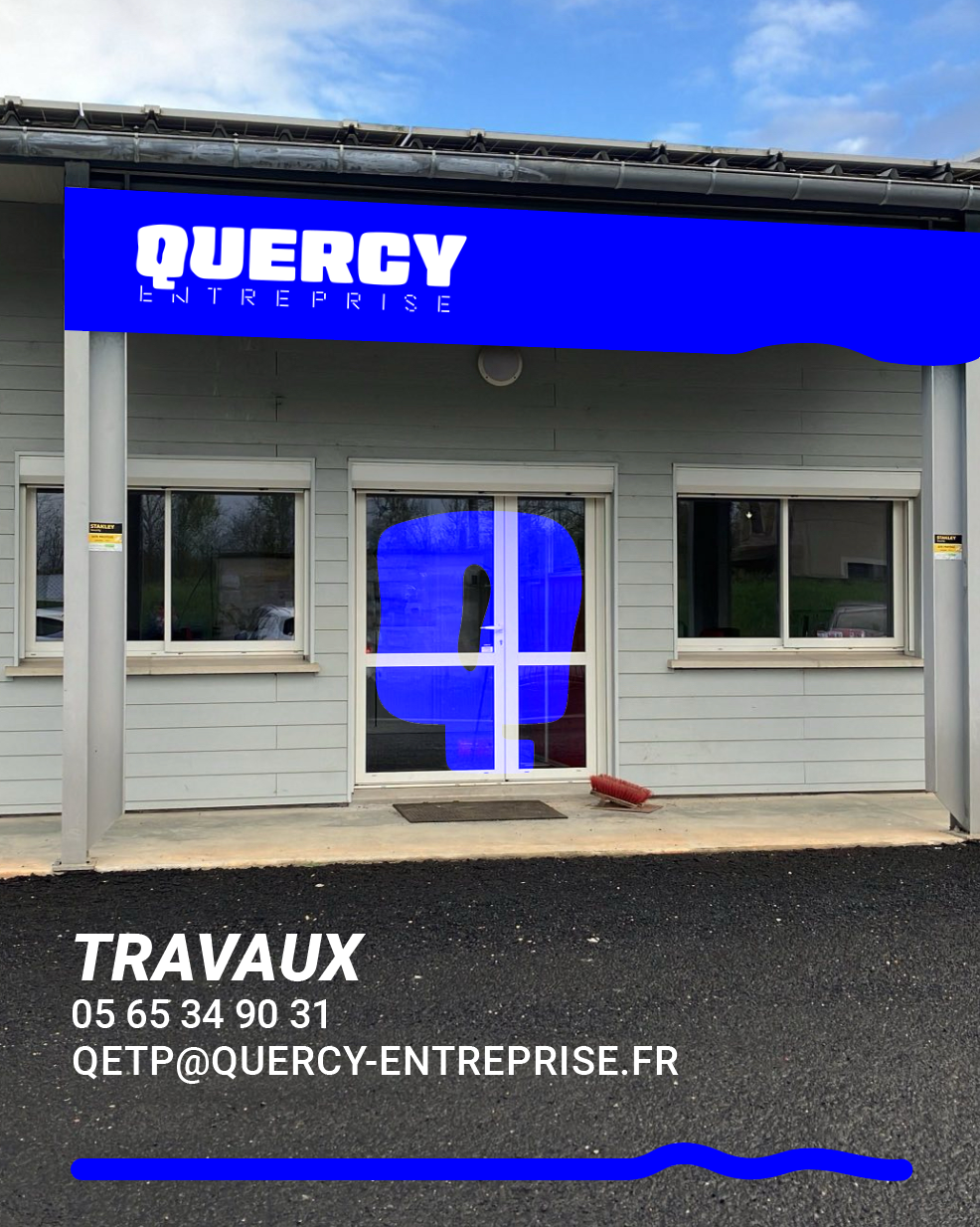
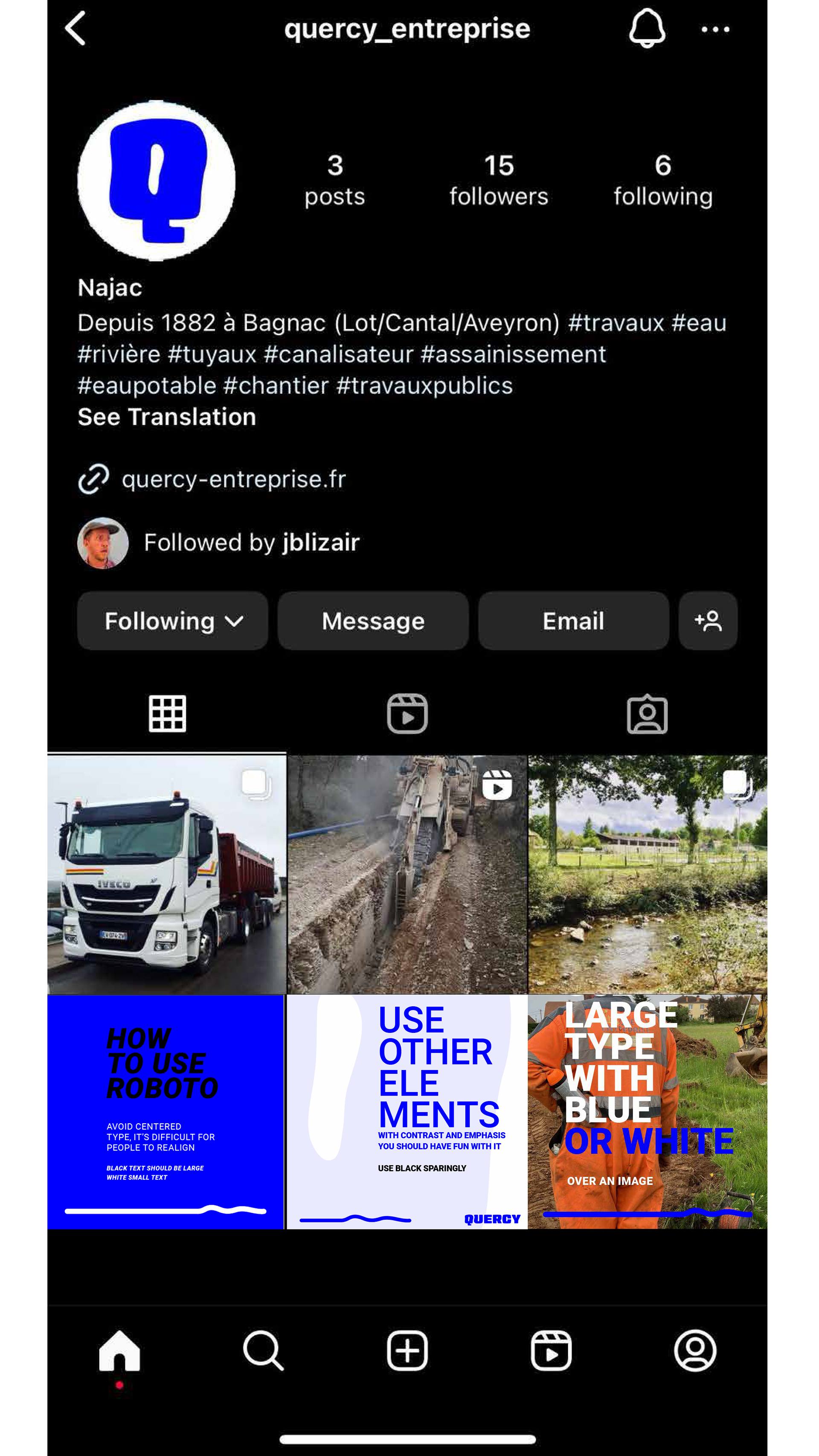
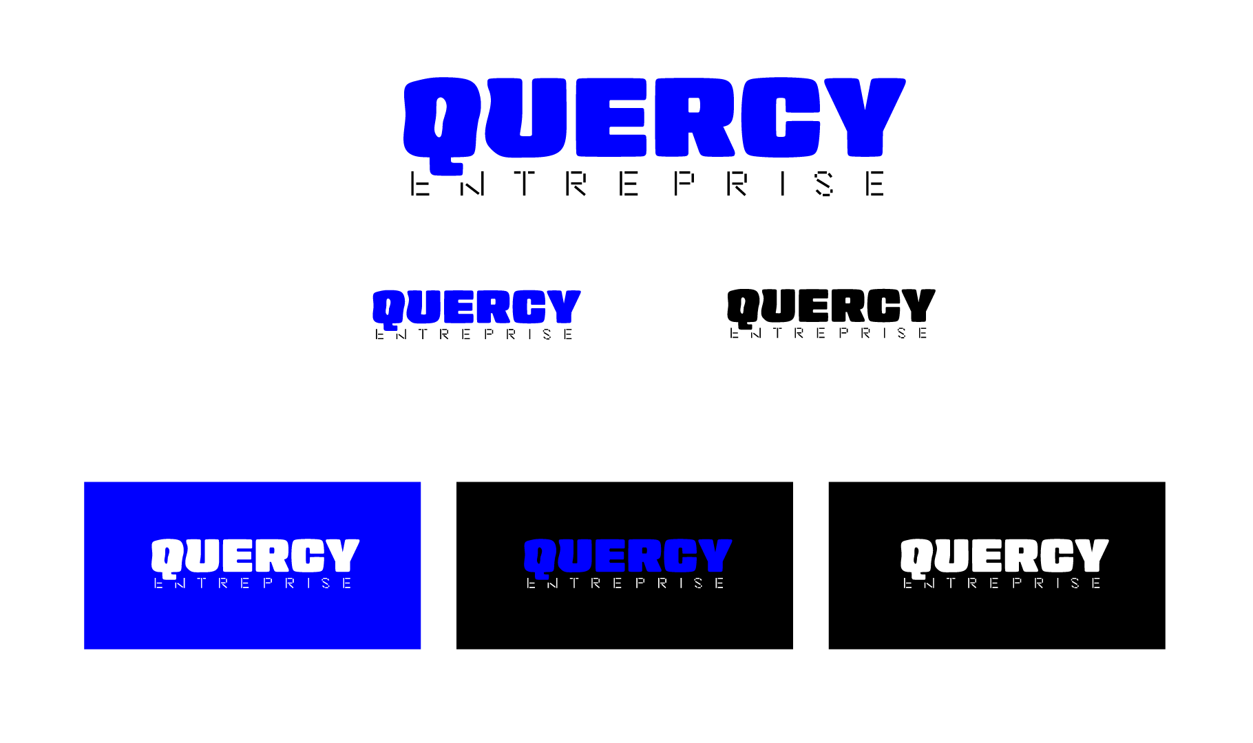
QUERCY ENTREPRISE REBRAND
Quercy Entreprise is a water and public works construction company in south-central France. I was hired to rebrand, produce all needed elements for the company including website (WIP) and Canva suite.
Quercy Entreprise is a water and public works construction company in south-central France. I was hired to rebrand, produce all needed elements for the company including website (WIP) and Canva suite.

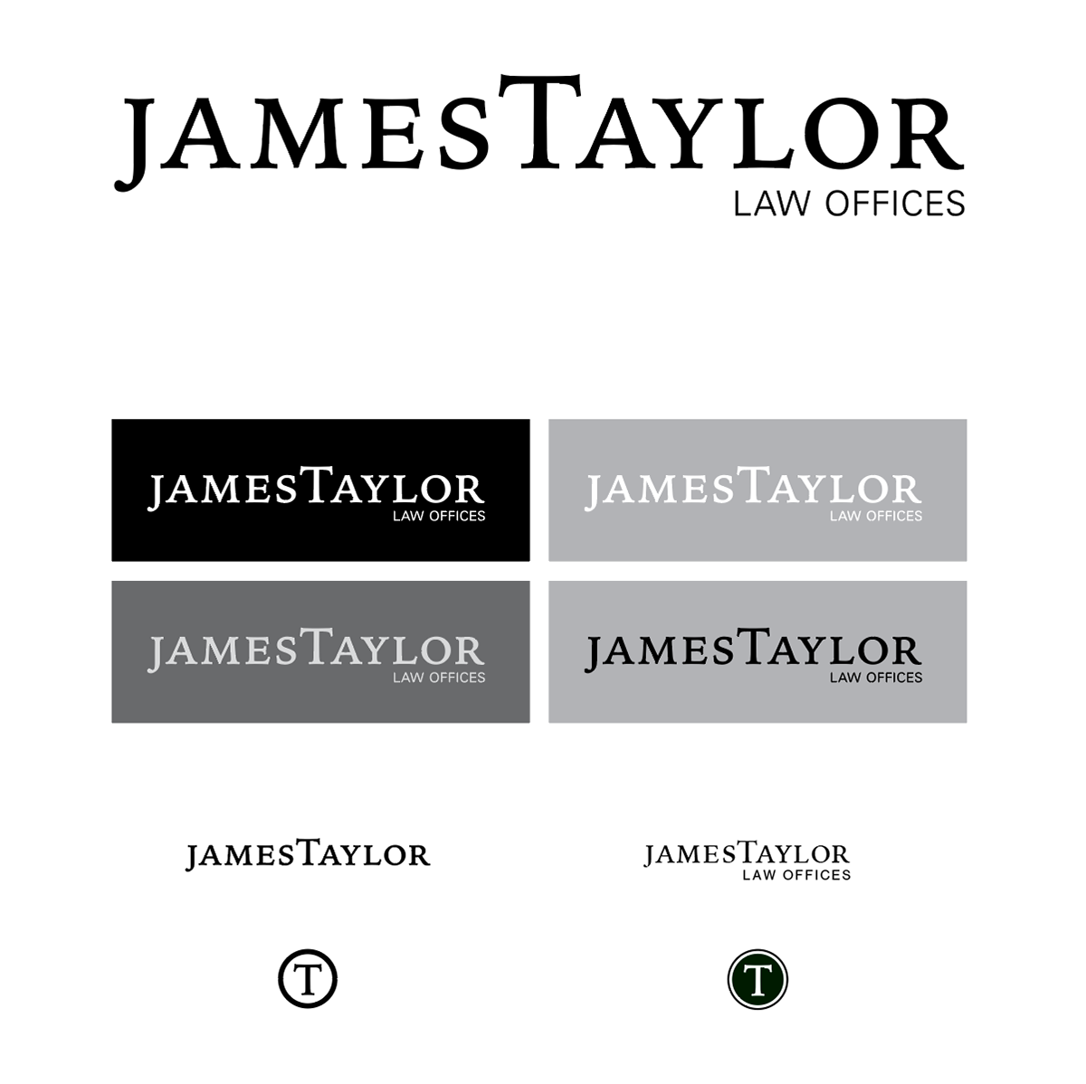
James Taylor Law Offices Branding
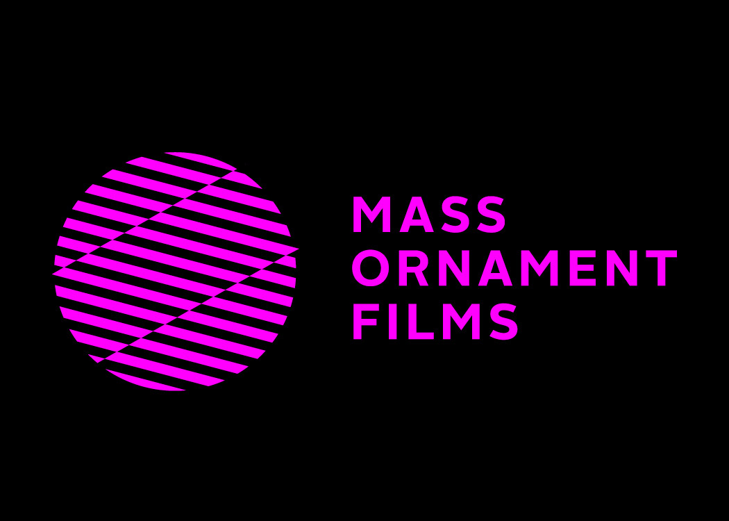
Logo/Brand: production company, (Mass Ornament, Chicago)
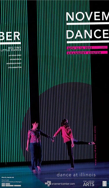
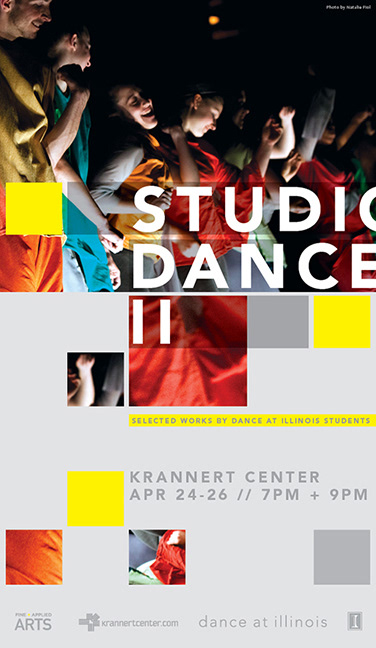
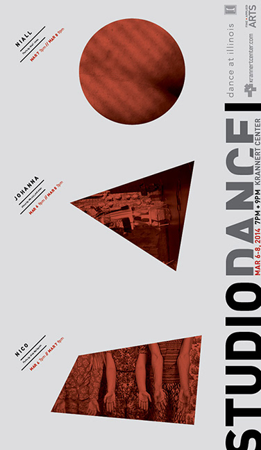
Krannert Center for the Performing Arts, and Dance at Illinois and
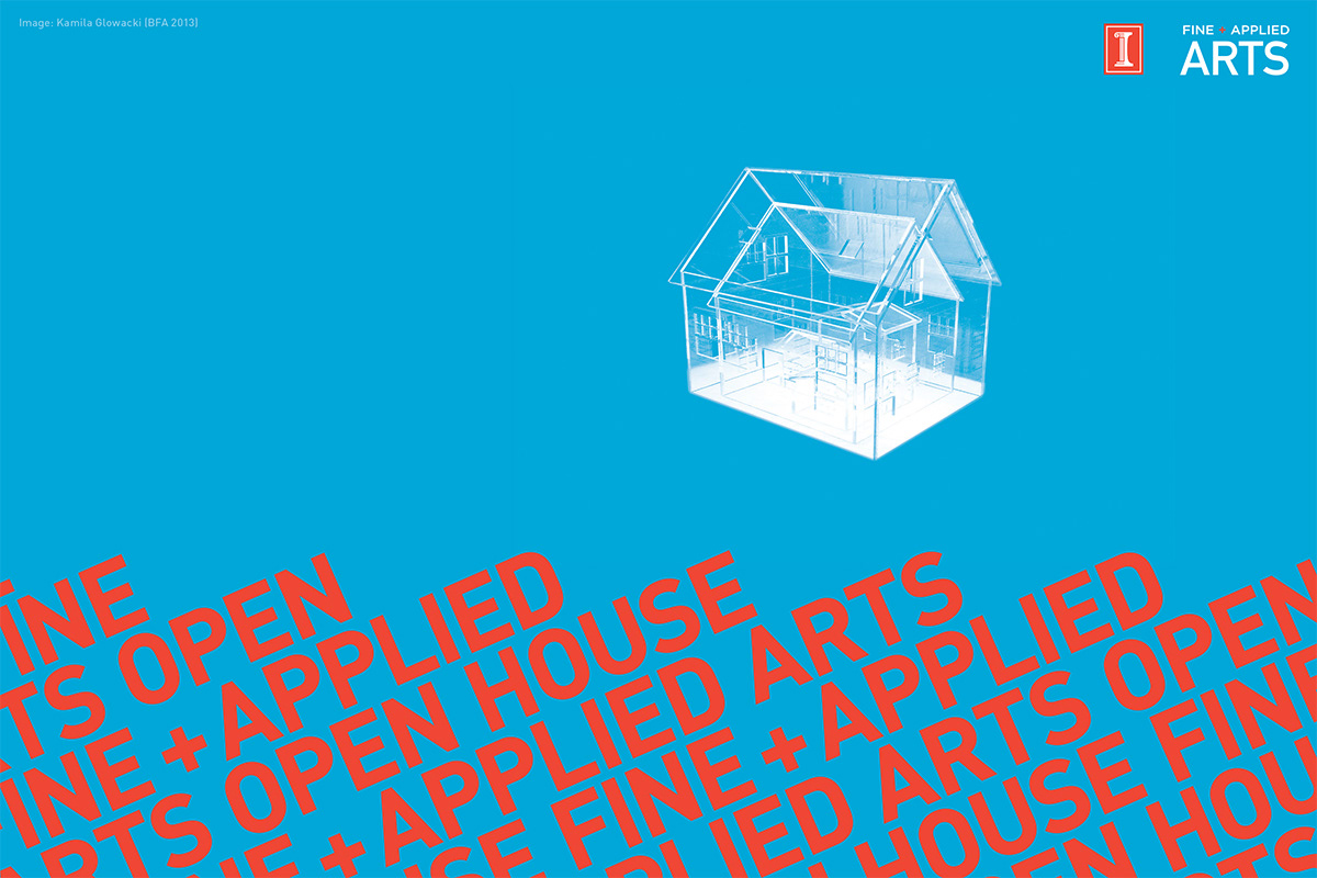
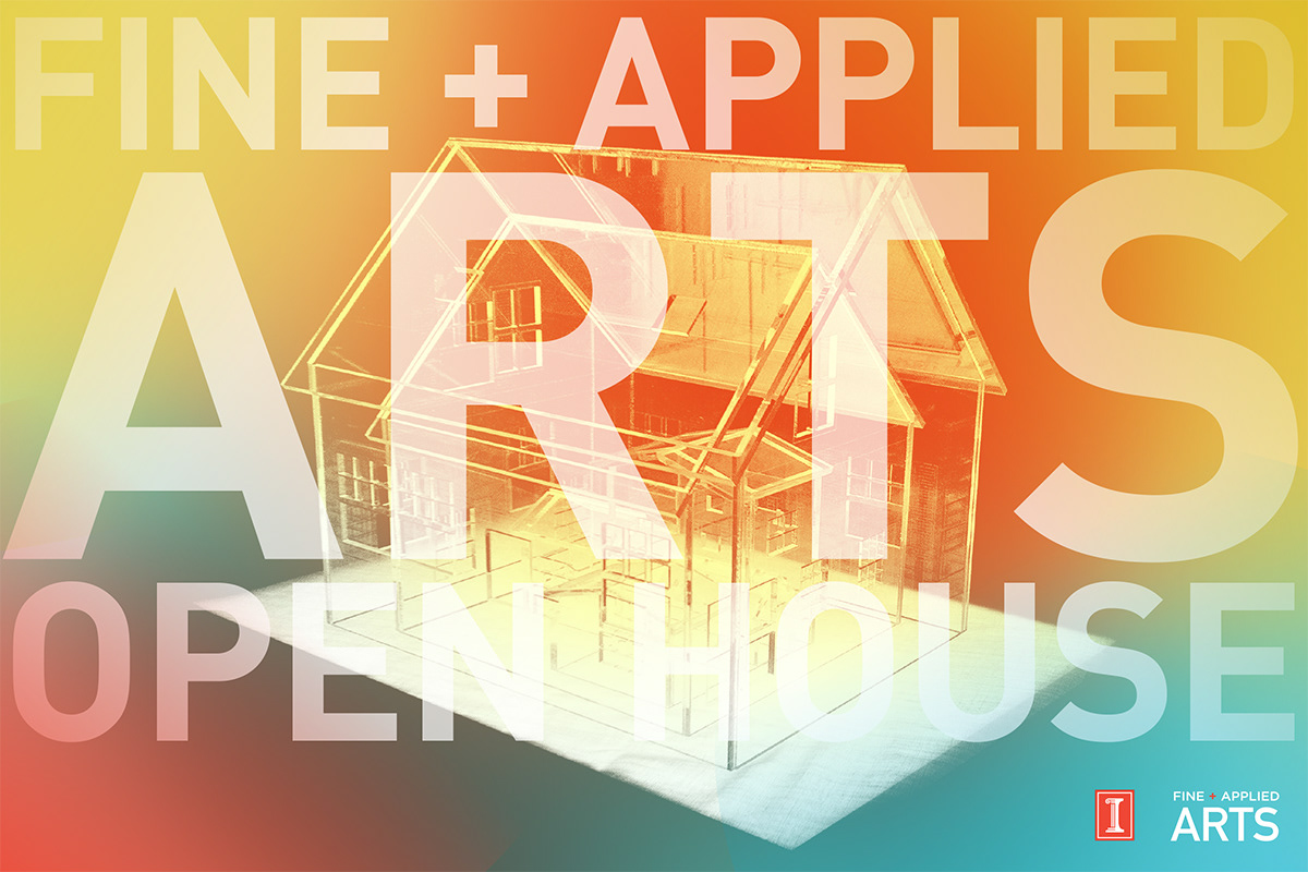
College of Fine + Applied Arts promotional and communications works
College of Fine + Applied Arts promotional and communications works

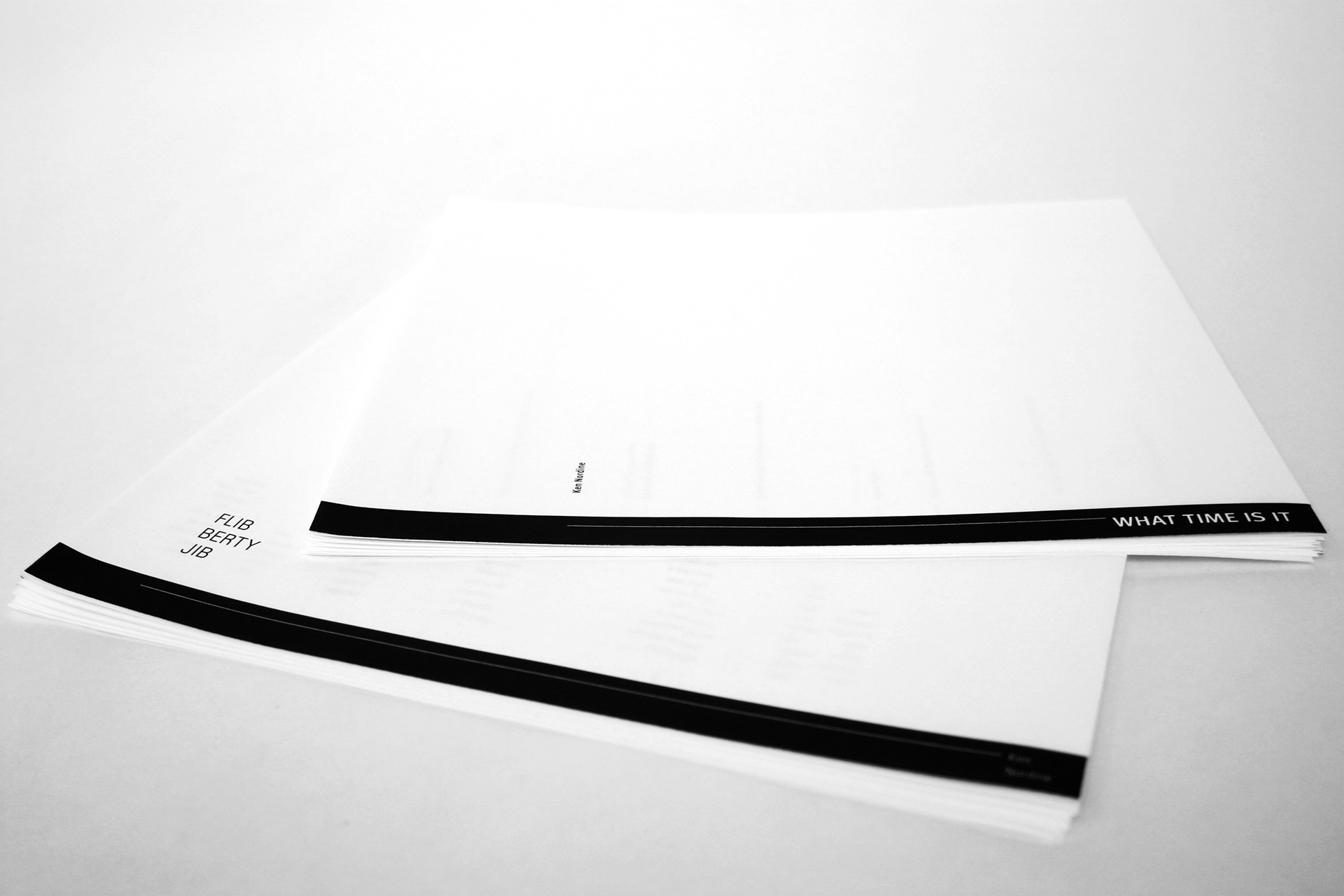
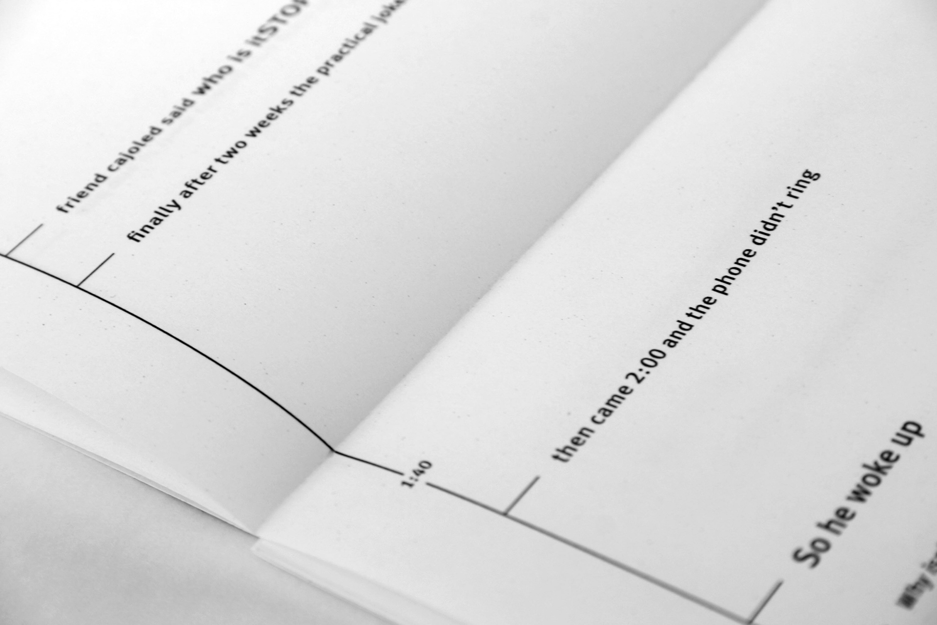
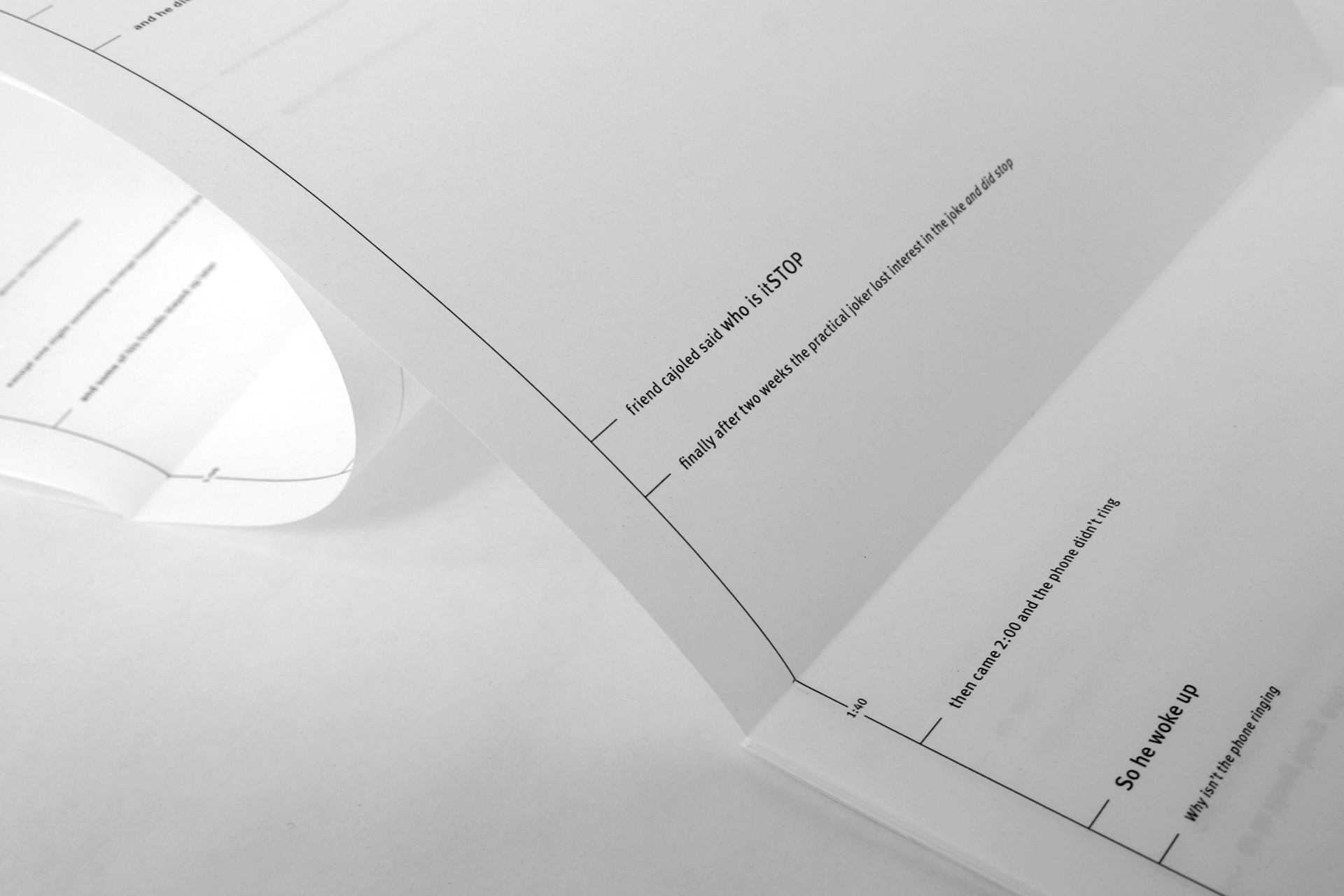
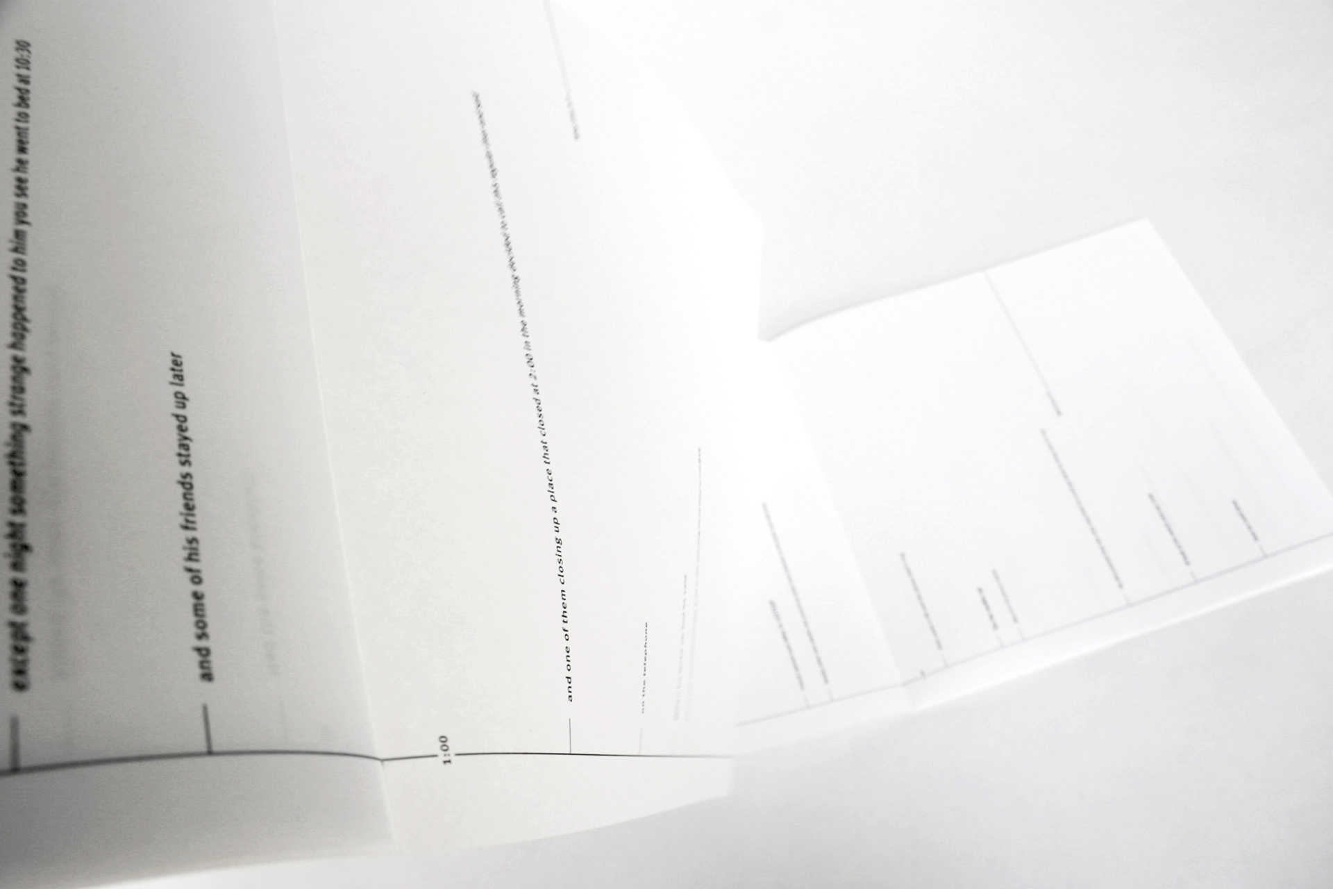
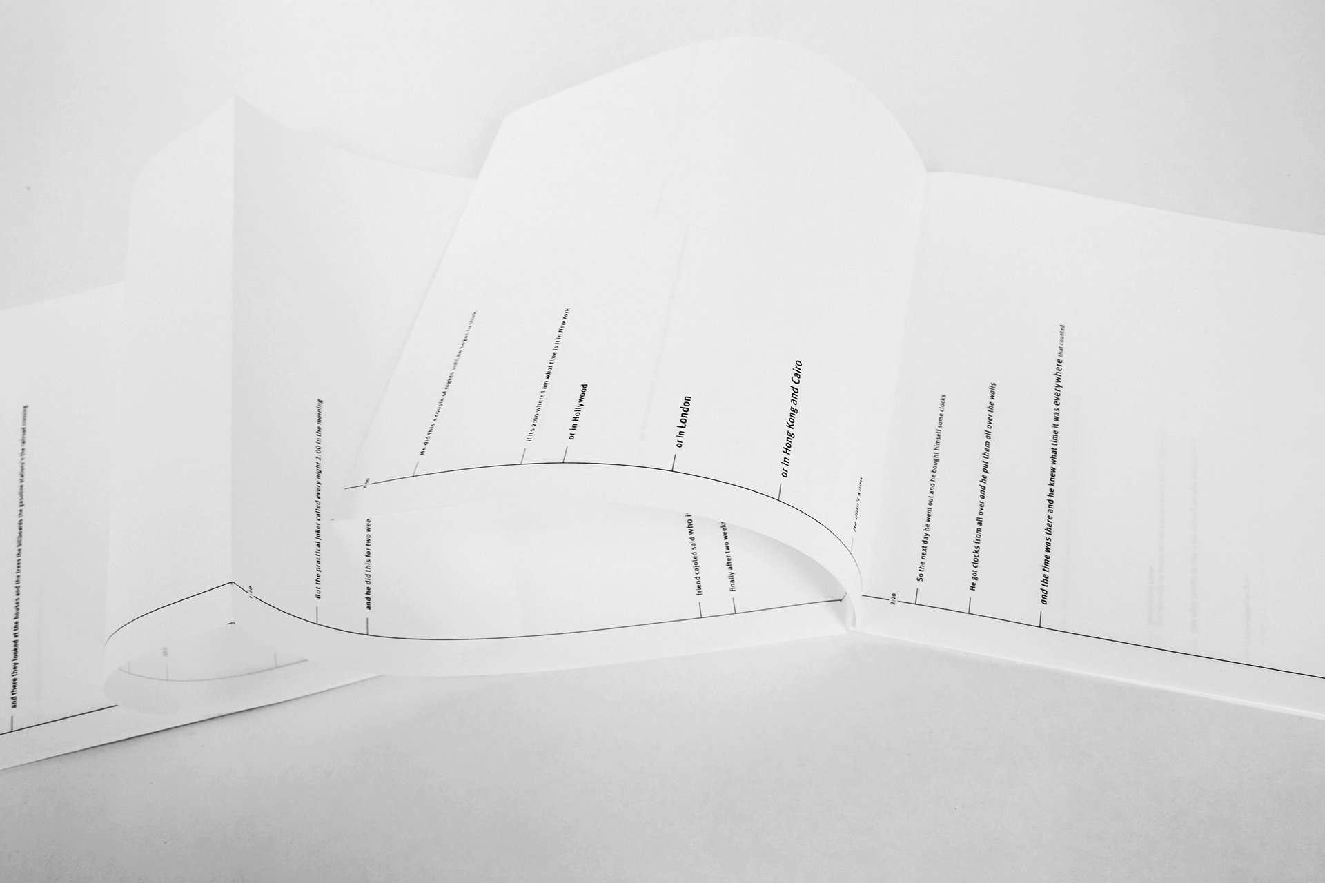
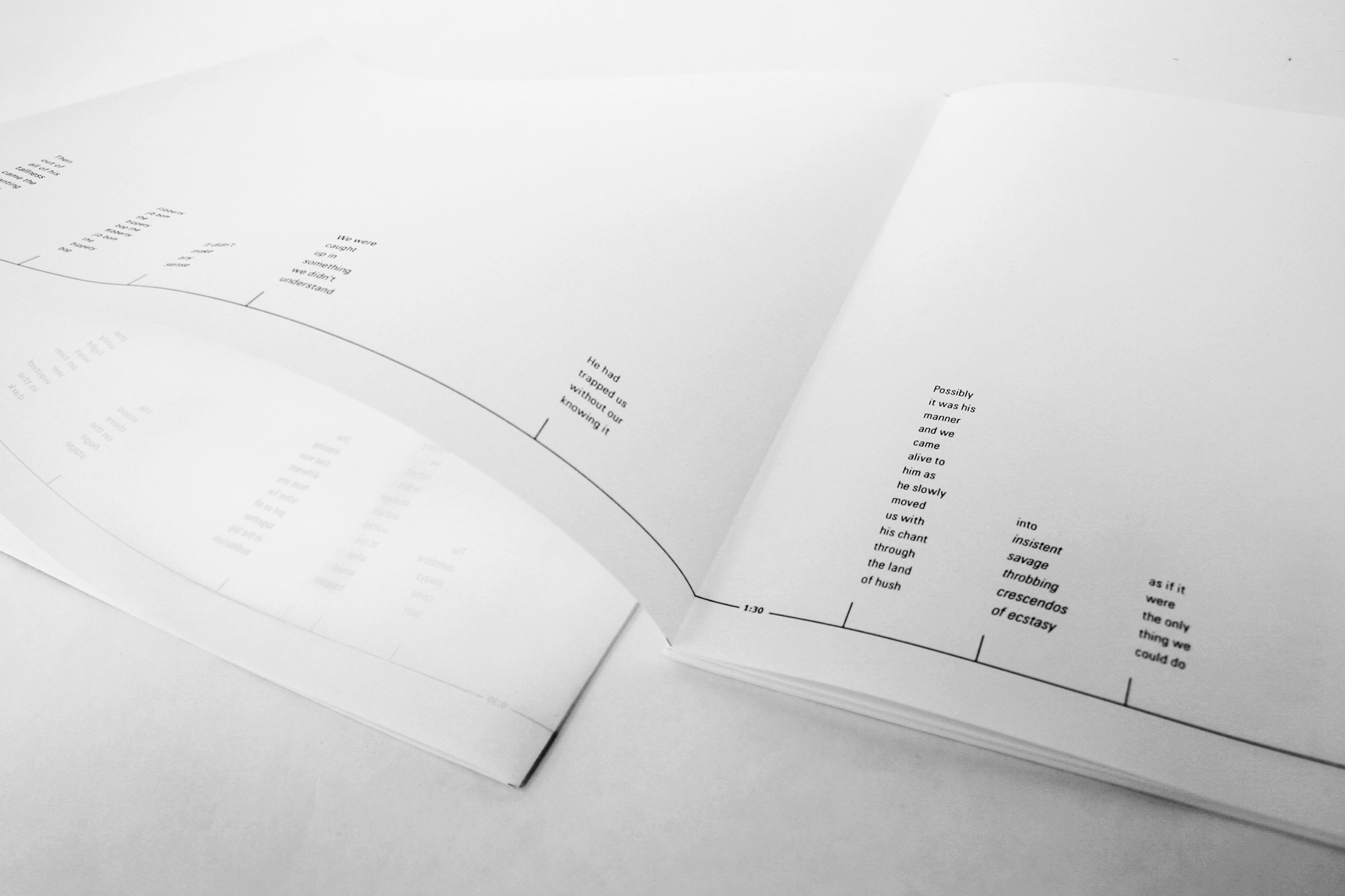
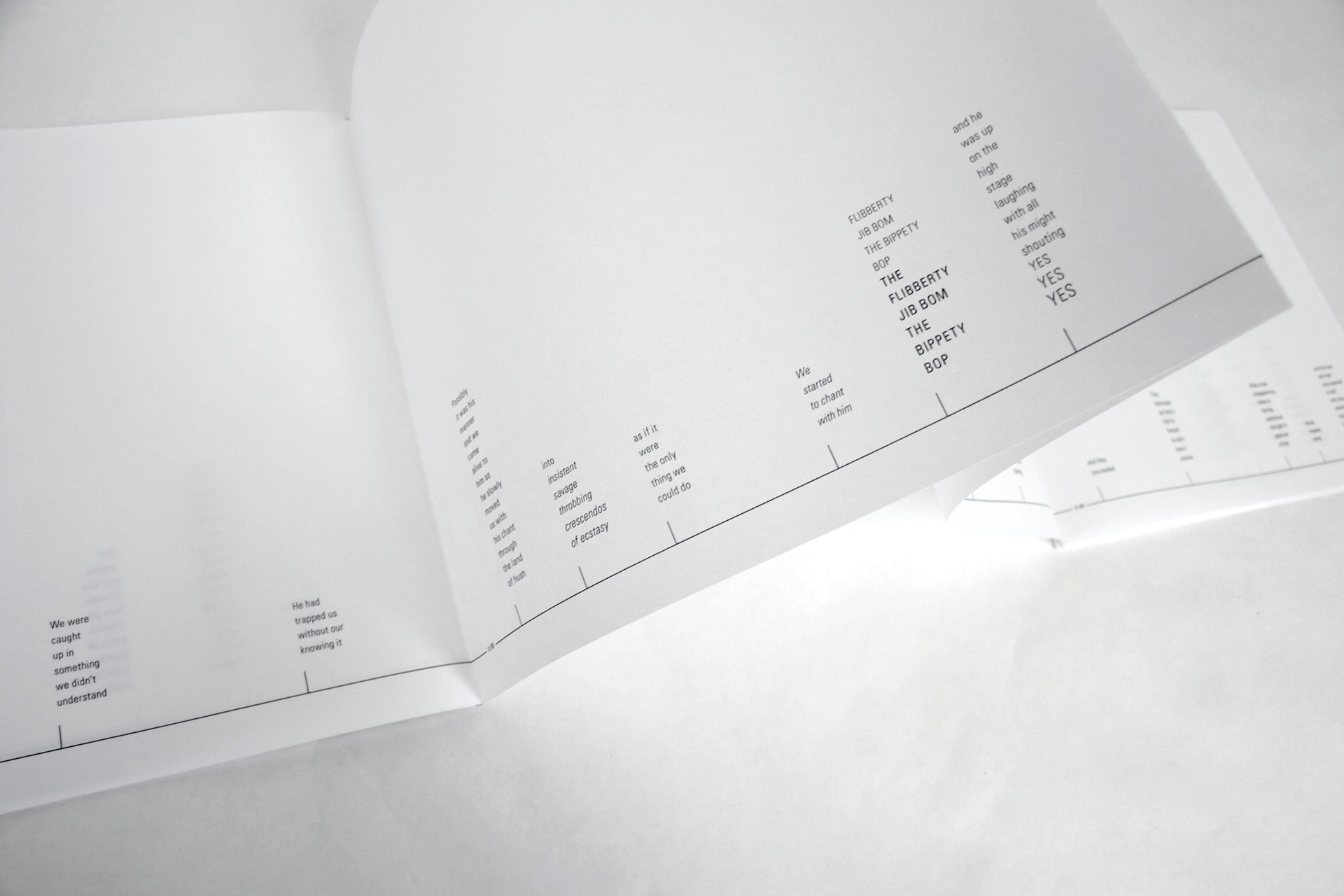
Ken Nordine: Word Jazz
Flibberty Jibb & What Time Is It
Spoken word poems were transcribed into two accordion books. All punctuation was replaced with type style variations, the time sequences are visualized and the paper is semi-transparent to preserve Ken Nordine’s unique voice.
9.5x8.5 folded, 105x8.5 unfolded. Printed on vellum architecture roll for slight transparency and seamless construction complementing the narrative.
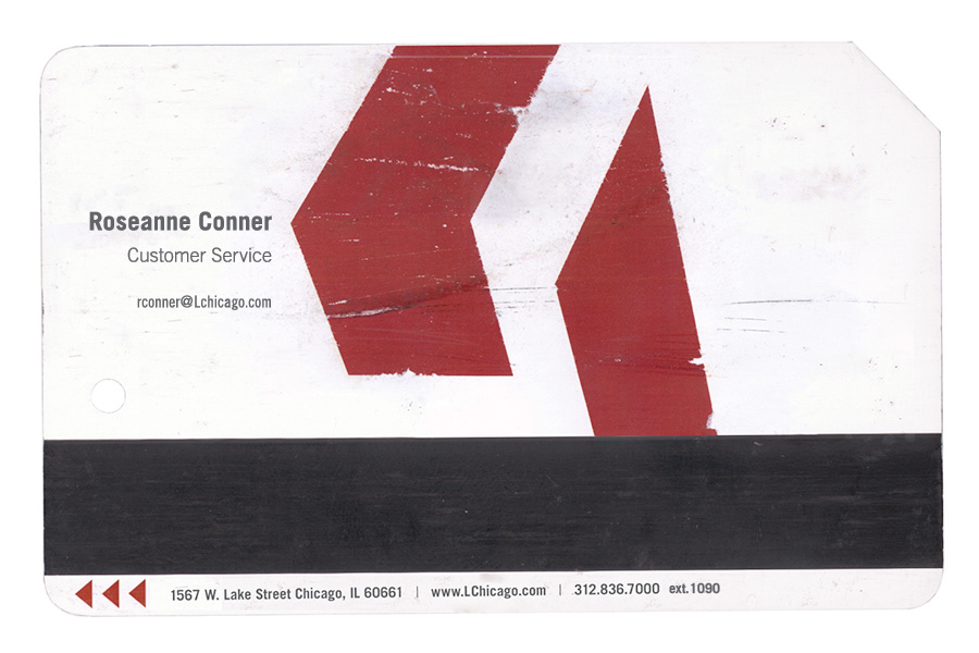
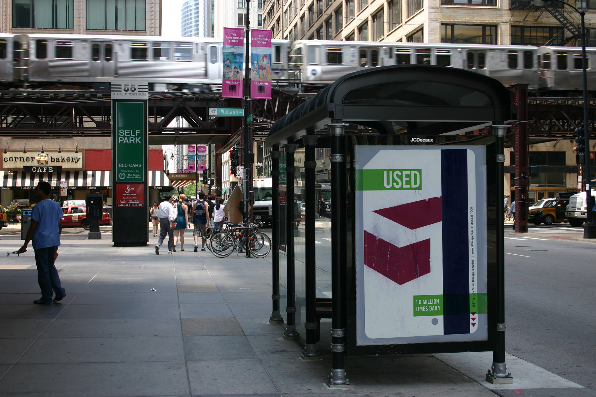
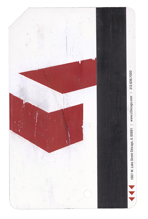
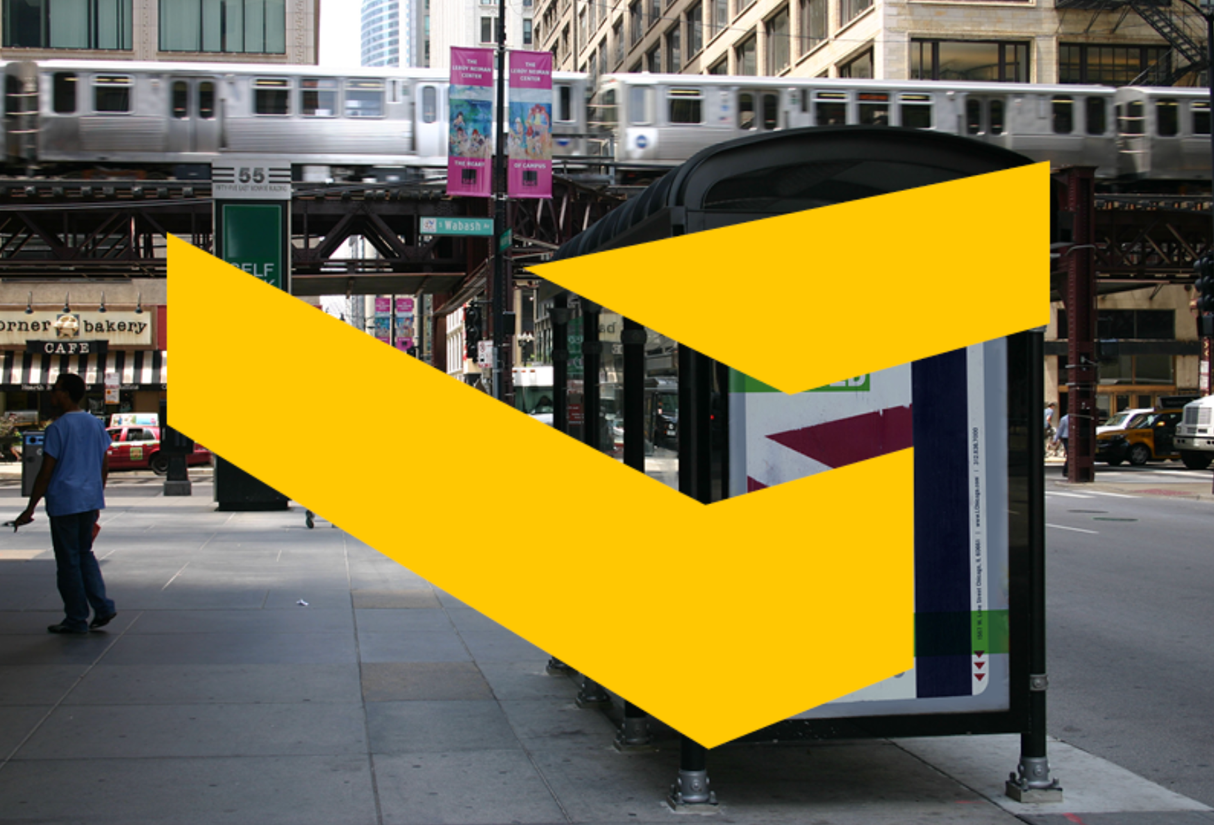
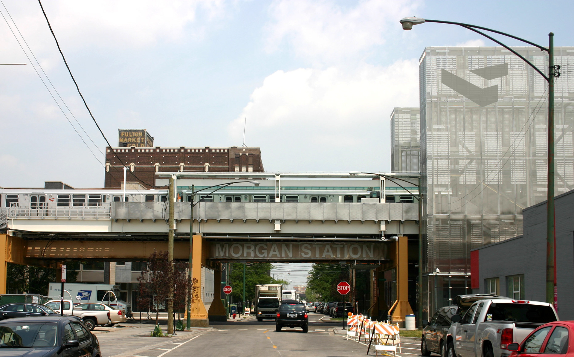
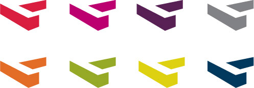
CHICAGO 'L' LOGO AND PROMO
logo and farecard
logo and farecard

Lines and Stations
Business card recycle program using discarded farecards